Search This Blog

Thursday, December 1, 2011

Anatomy of a Room-Shalini Singh's Bedroom

Photobucket


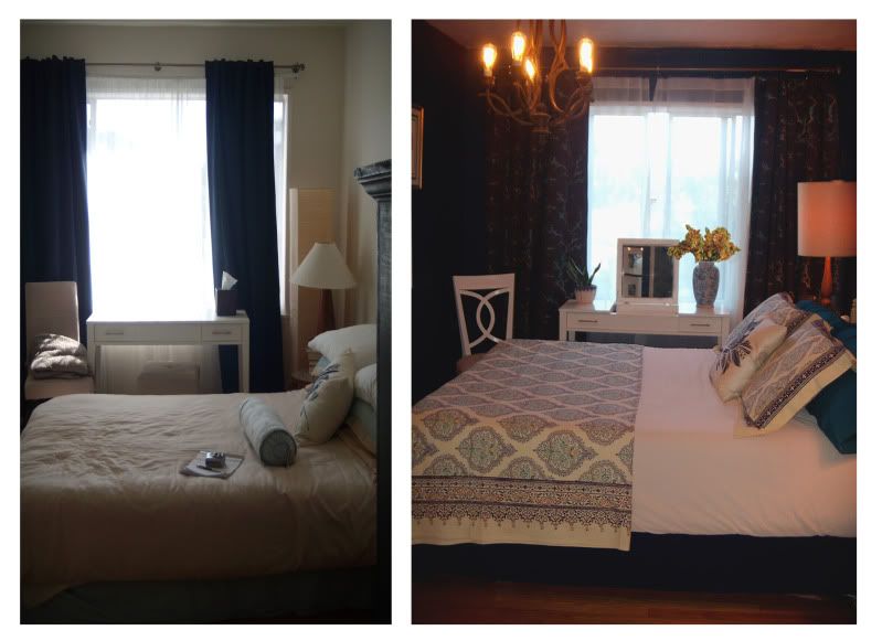
I recently worked on a quaint, one bedroom apartment in Santa Monica. My client, Shalini, wanted bold strokes mixed with soft neutrals to create an atmosphere that was part Hollywood glamor and part livable serenity. The rest of the apartment has a soft color palette of light yellow, gray, and pink with brown for grounding and silver for some glitz.
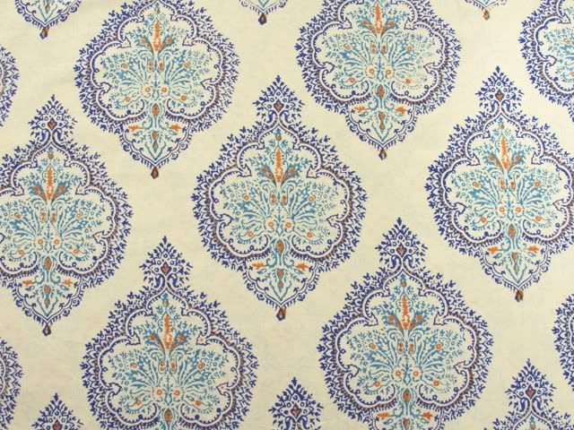
The bedroom was an area where we were not afraid to go dark because of ample natural lighting. Shalini wanted the room to be very relaxing and plush. She also wanted to incorporate a few Asian and Indian references to provide a subtle nod to her heritage. We were working within a very tight budget, so I had to get creative to create a sumptuous look and feel. The incredible bedding from Saffron Marigold became the inspiration for our color scheme. Quality bed linens are an area where you shouldn't skimp in a bedroom. This is your refuge and you should feel pampered.
Photobucket
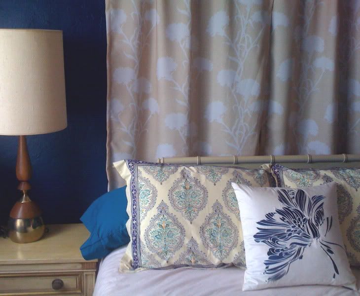
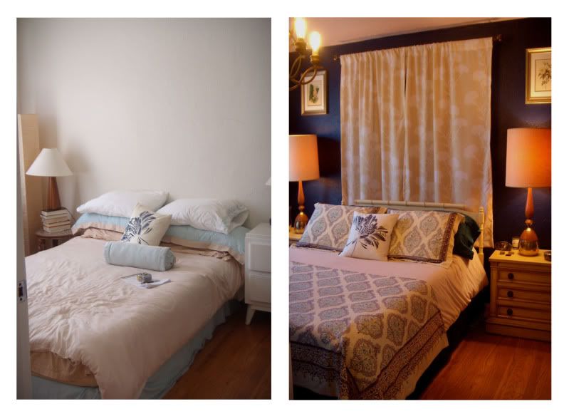
One issue in the room was improper scale. The mismatched nightstands were too small for the bed and the width of the room. There were also extra pieces that added more clutter than function. We found these terrific nightstands at 45 Three Modern Vintage for a steal. They anchor the bed and show off the glamorous wood and brass lamps that are large and tall enough for the up-scaled nightstands. We found these on Ebay, as well as the bamboo headboard. These items would have been at least twice as much in a store. I like shopping online, but nothing beats working with local merchants for their vast knowledge and it keeps these great stores OPEN. You will generally find more quality for less money when you buy vintage and antique pieces. Mixing new and old also creates a sense of timelessness.

Photobucket


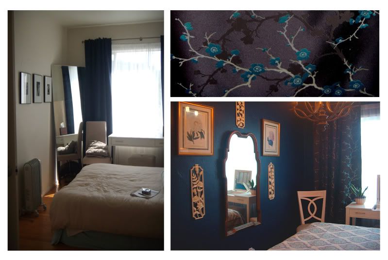
We decided to go with dark navy blue walls to add drama and depth. I think dark blue makes a great neutral because it is calming like the night sky and other colors look great with it. We popped in the turquoise of the bedding in the satin cherry blossom custom drapery. There are so many gorgeous and durable fabrics out there that will not break an arm and a leg. I am very lucky to live in Los Angeles where quality, economical design materials are plentiful. If you don't live in such an area, the internet is a great resource. You can order samples easily to see them in person.

In order to save money, you keep existing furniture that works such as Shalini's nice, modern, white vanity. We hung the leaning piece of mirror in the living room and put in a large curvy gold mirror which I found in an antique store for less than $100. We used gold as our glitz element in the bedroom, but sparingly. Light buttery yellow, white, and cream accents pop against dark blue walls and dark brown curtains. We replaced the standard flush lighting with a gold vintage chandelier in the bedroom and we created a light out of a capiz shell lamp shade she already owned. The fabulous black and white shower curtain from Dwell Studio compliments the floor tiles and the light pink walls in the bathroom. All of this adds up to a Luxe look for a whole lot less.
Photobucket
Photobucket


Monday, November 21, 2011

Anatomy of a Room-Roddy Bottum's Kitchen Parlor

Photobucket

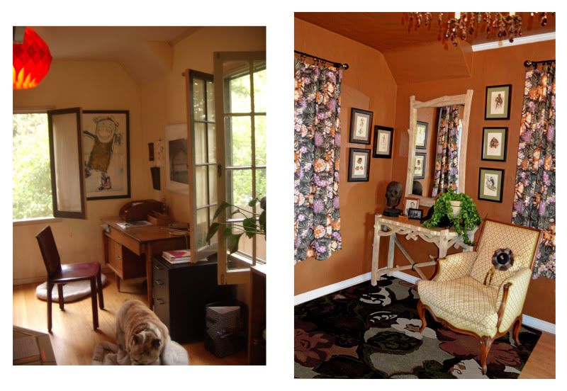
We are currently working on some wonderfully fun and functional rooms for Roddy Bottom in the Silverlake area of Los Angeles. Nature is the concept and the style is a whimsical mix of Traditional , Organic Country and a little Mid-Century Modern thrown into the mix.

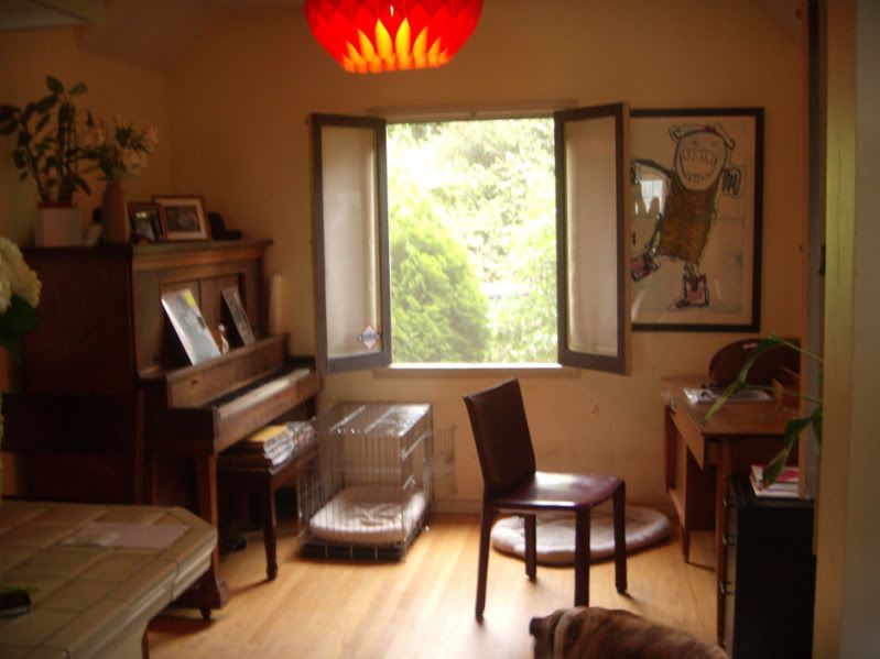
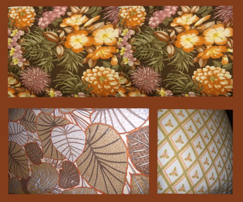
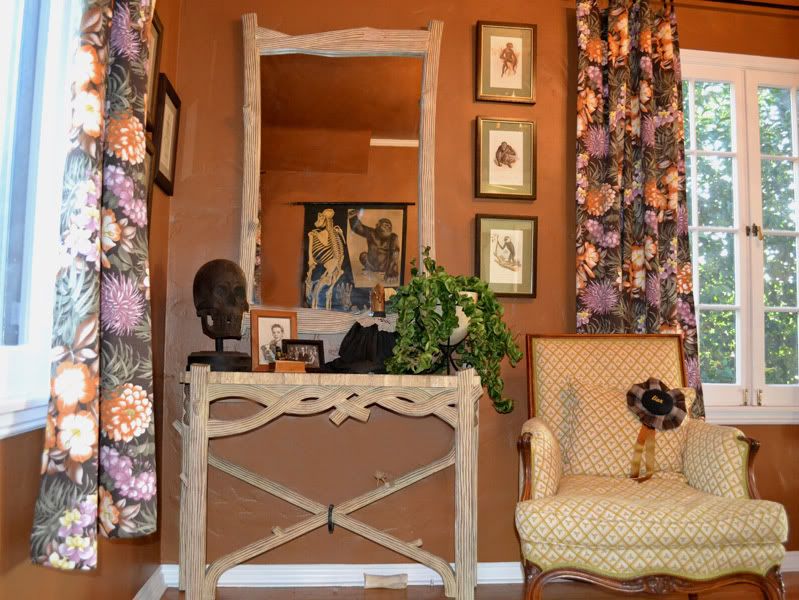
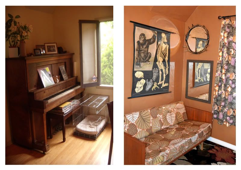
The small area above is a lovely little nook leading out from the kitchen and adjacent to the living room. The area was a moderately functional office and catch all that included a hardly used player piano, records, and doggy items. Since we would be relocating the office and there was already a nice breakfast nook on the other side of the kitchen, we had to figure out the best use for the space. We decided to create A Victorian inspired gentleman's parlor that would interpret our nature concept in a fun and fresh way. We used and autumnal color palette inspired by the drapery fabric below. The wall paint color was inspired by the caramel color of the small leaves. Using an earthy color on the walls will pop your bolder colors, while at the same time grounding them. We reupholstered the vintage 70's sofa in a vintage leaf print from the same period. The green and orange bee fabric on the French country inspired armchair has a traditional mod flair. All of the fabrics are united by the use of our dominant palette colors of brown, green, orange, and white.

Photobucket

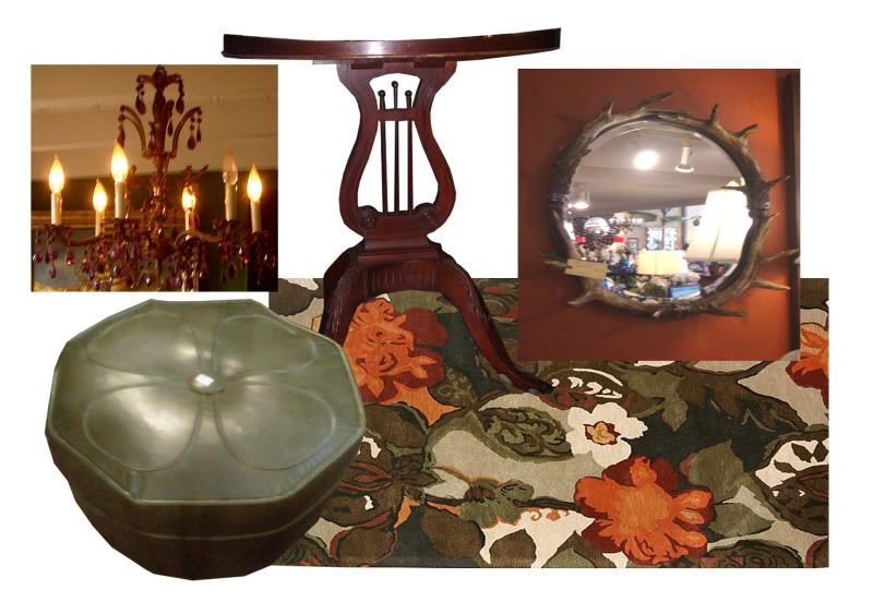
Accessories ad the next layer of color story and texture. We moved Roddy's purple chandelier from his dining room to add to the Victorian Luxe vibe and to pop in the color of the mums in the curtain fabric. This would be a secondary color to the scheme. The petite olive green ottoman and the floral Wool rug work with the other patterns and colors because of the shared palette. The Lyre table adds a formality and the stag mirror gives us reflected light and a rustic organic texture.

Photobucket

Put it all together and you get a relaxing lounge area for family and friends to spill out into from the kitchen. We also added a tall and narrow Danish modern shelf ( not pictured) to house my clients books so that the room can also double as a library for an evening of cozy reading. I love to take rarely used spaces and make them inviting and useful.

Photobucket

Photobucket

Photobucket

Thursday, August 5, 2010

Luxury on a Budget part 2

Photobucket
In my previous blog, I defined "luxury" as the perfect blend of comfort, glamor, and excitement in your home. My four KEYS to ""luxury on a budget" were FUNCTION, LAYERING, SMART SHOPPING, and an OVERALL PLAN. I would like to address the last two keys of "shopping" and "planning". These two items should be synonymous with each other, but they hardly ever are. A big mistakes that non-professionals make is shopping for the sake of shopping. When you do this, you end up with an abundance of disparate items that offer no cohesion in your space. This concept is especially important when you are shopping on a tight budget. You want your home to scream "Bohemian Glamor" and not "Bargain Basement". Without a plan, even the most exquisite and expensive items can look uninteresting and out of place. A plan helps you to figure out the relationship your furnishings have with each other and the space according to SCALE, PLACEMENT, AND COLOR STORY. After you have made a furniture plan, tape the outline of the pieces on the floor. This will give you an accurate idea of the size and scale of the pieces you need to buy. You should also measure paths and door openings to make sure that the piece can get into the space it is supposed to reside. You should always bring these measurements with you when you go shopping, because even the most well trained eye can make a mistake. Another item to take shopping is your budget breakdown so that you do not overspend on an item. If you fall in love with a piece that that exceeds your budget by a reasonable amount, you can crunch the numbers on other items to make up the difference. Every splurge should be followed by a sacrifice. I am not saying that you should sacrifice on QUALITY. You can find incredible bargains at many thrift and second-hand stores on well made vintage and antique pieces. If you have a talent for refinishing, then your options are endless. Craigslist is also an incredible resource for one-of a-kind treasures at astonishing prices. If you are purchasing new pieces, do your research on line before you buy. Amazon.com is a great resource for product reviews and comparison shopping. When you are scouting furniture and accessories for your home, always remember to "be prepared!" Save your impulse buying for the grocery store. If all of this planning makes your head spin, you might consider hiring a professional designer.

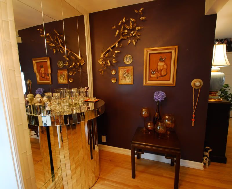
Our friend and client, Jackie Beat, recently wrote an article about luxury in Frontiers magazine. Jackie knows how to smart shop on a budget and it shows in his lovely home pictured above. You can view Jackie's article with the following link:
http://www.frontiersweb.com/Columns/Little-Miss-Know-It-All/story.aspx?ID=1255871

Luxury on a Budget

Do the words "luxury" and "budget" seam diametrically opposed to each other? If you equate luxury with a high price tag or you can only be surrounded by objects with designer labels, then this article is not for you. If you define luxury as a lifestyle that perfectly blends comfort, glamor, and excitement, then you have come to the right place. The four keys to creating a luxurious environment without blowing your budget are Function, Layering, Smart Shopping, and and Careful Planning.
Function is the most important element because it builds the foundation for how you can maximize the comfort and ease of using your space. A cluttered and disorganized home is NEVER glamorous. Make sure there is a place for every thing, and that your storage systems are attractive and complement your overall design scheme. The internet is a great resource to compare storage products and also to find informative product reviews. If an item scores high in QUALITY and VALUE, then you can feel confident in your purchase.
Layering is the second key and this involves paint, fabrics, lighting, and accessories. Paint is the easiest and most economical way to add drama to your space. You can also give found furniture a whole new life with a high gloss paint or interesting treatment. Fabrics are essential to the layering process and can add color, texture, pattern, and sheen to your design. Many fabric stores have sale tables where you can find sumptuous and elegant materials at a fraction of the cost. Lighting is an element that is often overlooked. You can create a special ambiance by mixing mood and task lighting and installing dimmers. Candles are also a cheap and easy way to add romance and atmosphere. Controlling the mood of your environment can make you feel like master of your domain.

To Be Continued.....

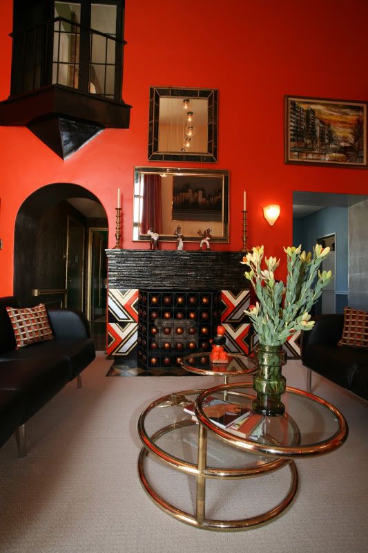
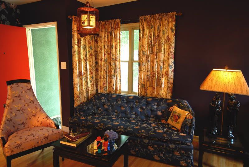
The following rooms are good examples low-budget luxury.
Photobucket

Photobucket

Photobucket

Photobucket

Wednesday, June 23, 2010

My Bathroom gets a Dramatic Facelift!

Photobucket

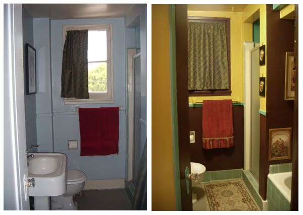
Who says that you have to be Joan Rivers to get a face lift? Many people's rooms deserve the same treatment. I have recently been performing face-lifts on some historic Los Angeles apartments for clients with limited budgets. It can be quite an expensive and ardous task to try and repair what 50 to 100 years of changing hands has done to an interior. You have to evaluate the reality of what your budget will allow for in a space that will someday return to it's owner.

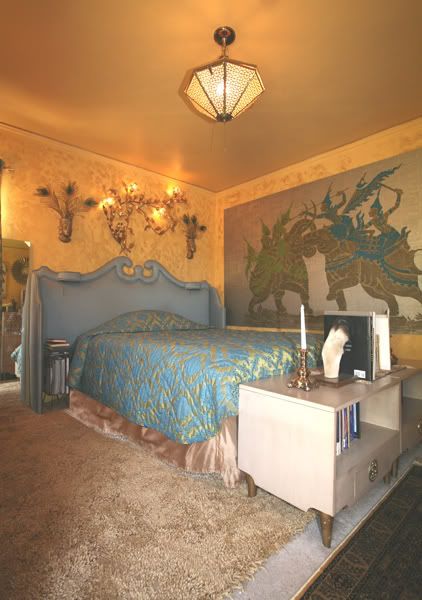
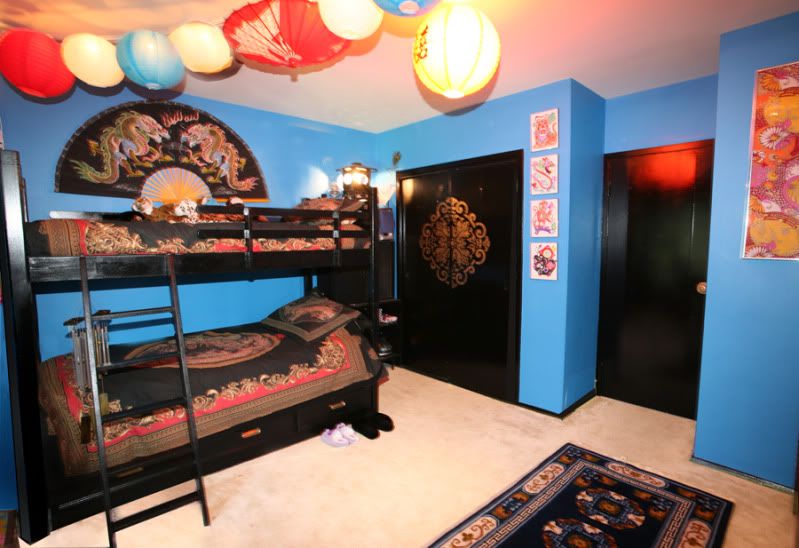
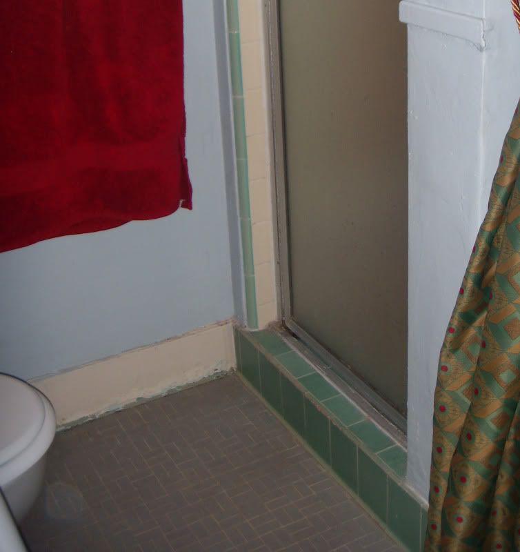
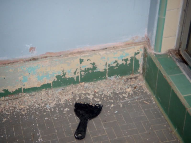
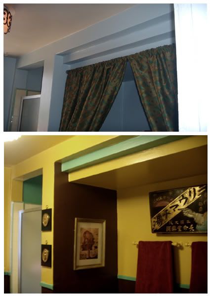
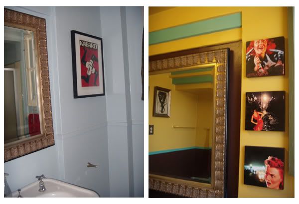
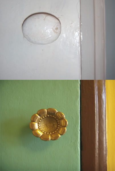
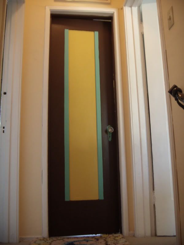
Our bathroom became the afterthought of our apartment. We have been living with it, but is was time to complete our home by doing it the way we wanted. I wanted to pay homage to my unique Art Deco apartment by creating a room of contrasts and drama, while retaining a bright and sunny atmosphere. I stripped 70 years of paint off of our beautiful green tile border that creates a base molding around our bathroom. Some "bright" person long ago made this decision and everyone else then followed suit. My color palette was inspired by Deco and the Viennese Seccession. I was originally going to use black, yellow, and aqua(the tile color). I decided to use a dark brown instead of black to warm up the palette. I alternated my colors to create impact as well as showcase the Art Deco architectural features. If you have a special period home, take inventory of what elements are original and important to the integrity of the structure.

Photobucket

Isn't that paint over the beautiful tile just awful? The crevices created by all the paint also made it difficult to clean. Ick!

Photobucket

This kind of stripping is not fun or sexy. Luckily, we used an eco-friendly product with a nice citrus scent.

Photobucket

The step pattern over the bathtub was enhanced by the alternating colors.

Photobucket

Photobucket

The fantastic trio of pieces to the right of the mirror were created by Portland artist and DIY lounge host, Richard Fox.

Photobucket

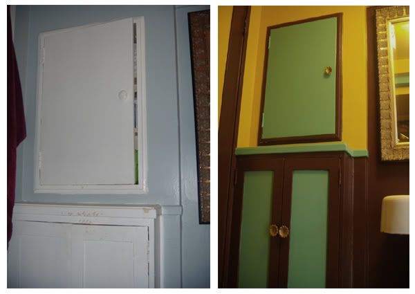
This cabinet needed lots a TLC and some new pulls. What was once generic is now a glamorous focal point.

Photobucket

Photobucket

Wednesday, May 12, 2010

Shanghai Hosts the World

Photobucket

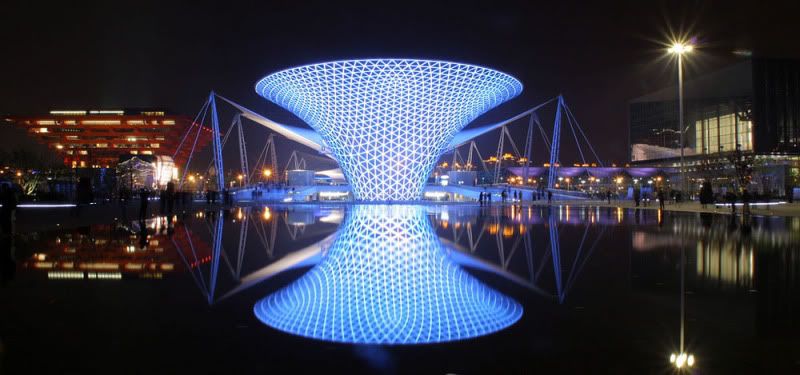
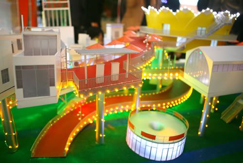
The Shanghai World Expo 2010 is now in full swing. I have been watching from the cyberspace sidelines in amazement at how the countries of the world decided to represent themselves and their contributions. It's kind of like "America's Next Top Model" for developing countries. They have even even grouped together the "Axis of Evil" contributors such as North Korea and Iran. The level of contemporary kitsch seems to be off the charts. I have noticed some similar inspirational thread between many of the pavilions. The overall theme of the Expo is "Better City, Better Life". I have pictured many of my favorite pavilions below under my own appropriate categories.

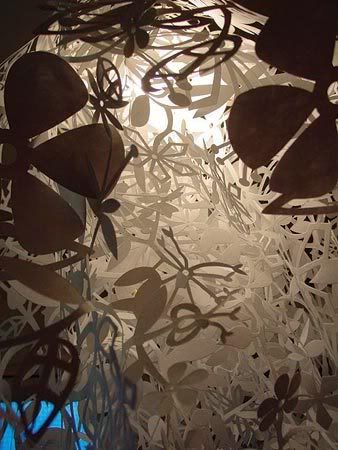
THE TORD BOONTJE INSPIRED PAVILIONS:
Photobucket Photobucket

Photobucket

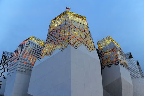
The Russian Pavilion makes the transition from day to night.

Photobucket

Photobucket

Photobucket

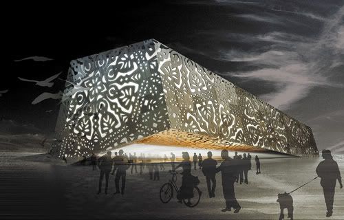
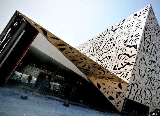
The Poland Pavilion pays homage to it's paper-cutting craftsmen and with this feminine, modern structure.

Photobucket

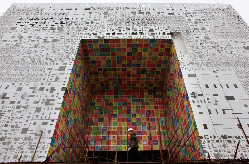
The South Korea Pavilion uses die-cut numbers and letters to create its facade. The colorful facing of the other material juxtaposed to it reminds me of the Eames' House of Cards.

THE RETRO FUTURISM INSPIRED PAVILIONS

Photobucket

The UK Pavilion was designed by Thomas Heatherwick and consists of a swaying chorus of acrylic rods. Very Mod.

Photobucket

The Israel pavilion reminds me of the work of Architect John Lautner.

THE DISNEYLAND INSPIRED PAVILIONS

Photobucket

I love how the Danish pavilion resembles a Tutti-Frutti factory

Photobucket

The real thing is very delightful and the umbrellas complete this whimsical entry.

Photobucket

The Chinese Pavilion makes a very iconic statement.

Photobucket

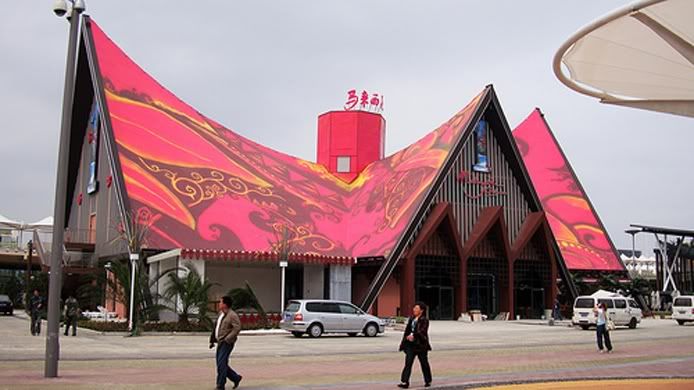
The groovy Malaysian Pavilion looks ready to party with its psychedelic roof.

Photobucket

Speaking of parties, the opening ceremony featured the Expo mascot representing over 190 countries. The Mascot is named Haiboa who looks like Gumby mated with a lady smurf . A chorus line of these kitschy cuties cut a rug in "It's a Small World" style.

THE EARTH MOTHER PAVILIONS:

Photobucket

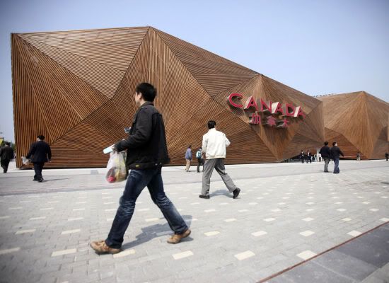
Canada's Pavilion looks like a rocket that was made out of toothpicks and ready to blast off!

Photobucket

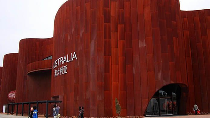
the Australian Pavilion is made of a special weathering steel that looks very woodsy and 1970's.

Photobucket

Photobucket

Photobucket

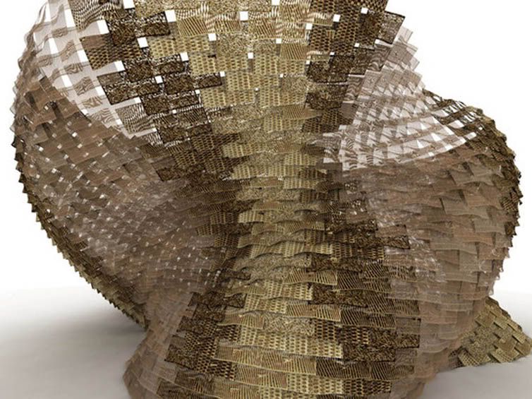
I love the Spanish pavilion and its undulating ruffles of raffia. The giant baby adds an element of the bizarre.

Friday, April 23, 2010

Jackie Beat's Glamorous Garage Sale-This Weekend!

Photobucket

What do you get when one of the most fabulous drag queens (who just happens to be a compulsive shopper with great taste!) and two of LA's most popular and innovative interior decorators (and former co-owners of uber-cool store Retropia) join forces? THE MOST GLAMOROUS GARAGE SALE IN THE HISTORY OF ALL MANKIND!
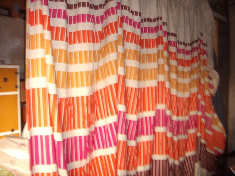
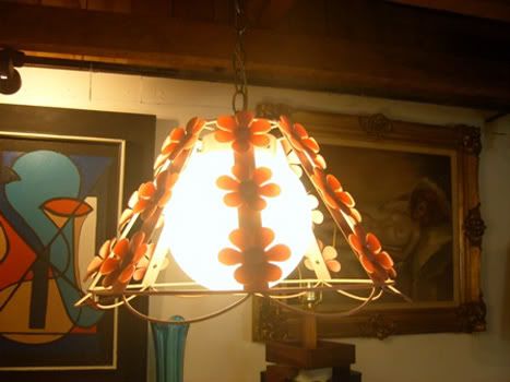
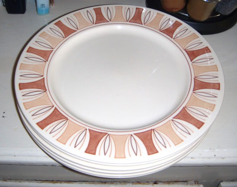
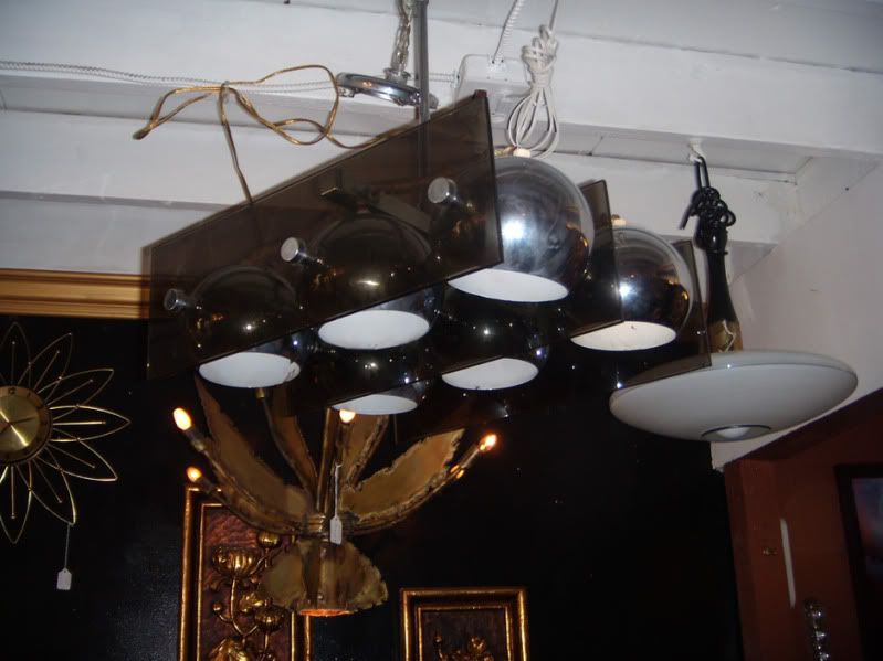
Furniture, art, linens, clothing, kitchenware, barware, lighting, clothing (lots of DRAG!), shoes, gardening equipment, bedding, records, books, CD's, DVD's, knick-knacks... YOU NAME IT! Even a new queen-size mattress, lawn mower, bicycle and TONS OF MEMORABILIA AND COLLECTIBLES!

Plus FUN, FUN, FUN in gorgeous Highland Park!

NO EARLY BIRDS! Early birds will be shot, taxidermied and sold to one of the creepy hipsters who shows up ON TIME!

SATURDAY & SUNDAY,
6133 Outlook Ave LA CA 90042
9 AM to 3 PM!

Here are some of the groovy items you will be seeing:

Photobucket

Photobucket

Photobucket

Photobucket